Our Story
Care doesn’t have to be complicated, especially when your skin is.
At Oatie, we want to create good quality and personalised skin care, without confusing terminology or outlandish claims. We aim to educate our customers with easy to understand and inclusive language. After all, we all have skin.
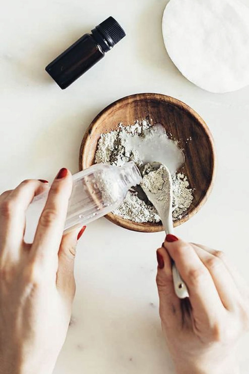
We use all-natural ingredients with oats as a foundation for all of our products for happy, healthy skin.
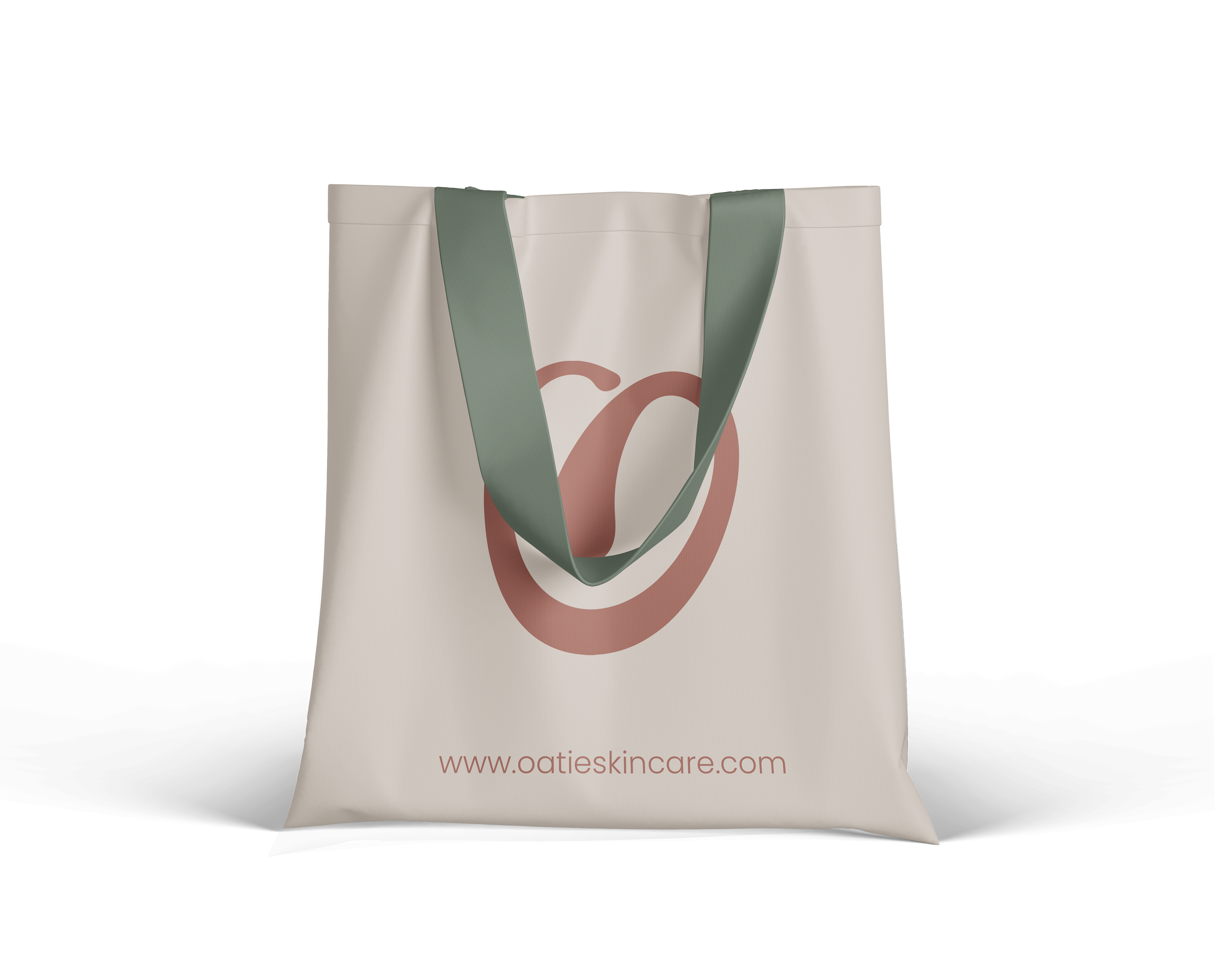
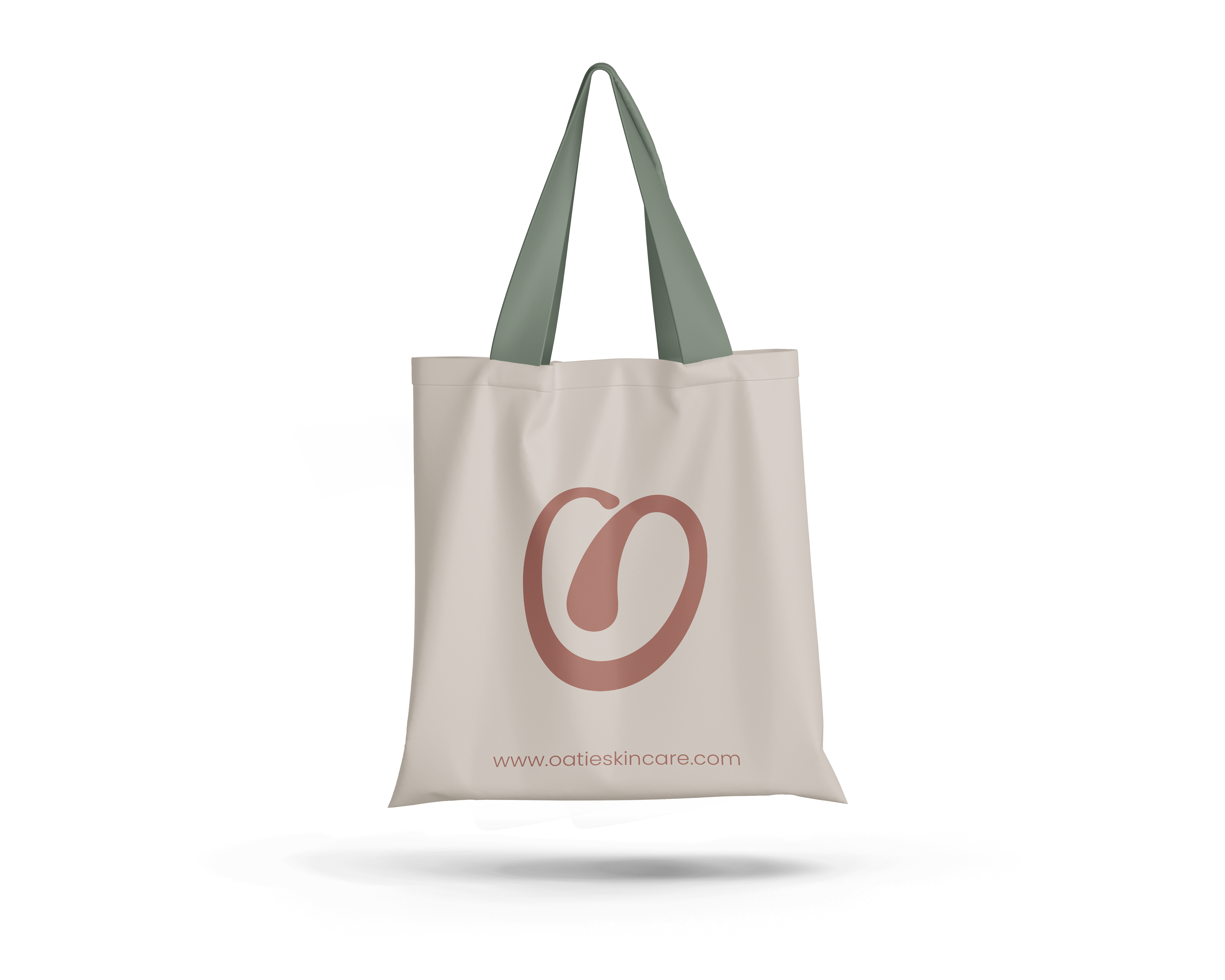
Our Logo
There are three separate components that represent three parts of our business:
An oat, to represent our foundation ingredient.
A heart, to represent our care and love for our customers.
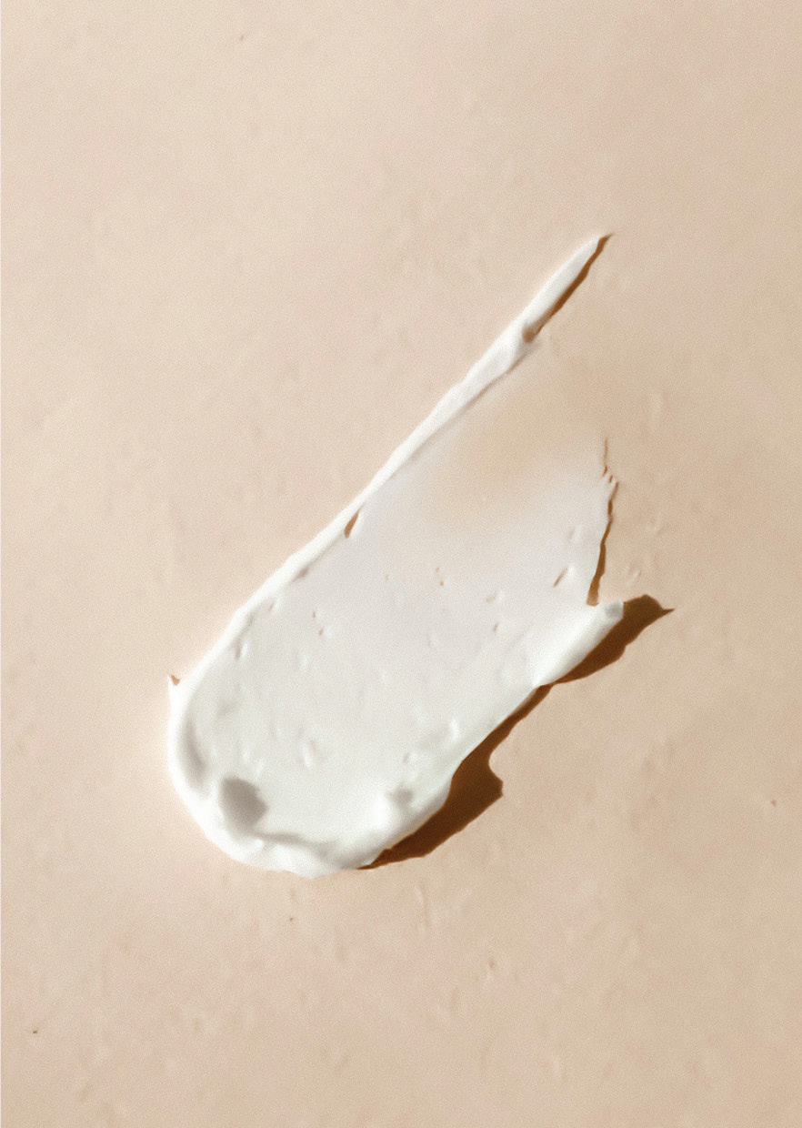
A smear of product, to represent skincare.
A smear of product, to represent skincare.
Our Colours
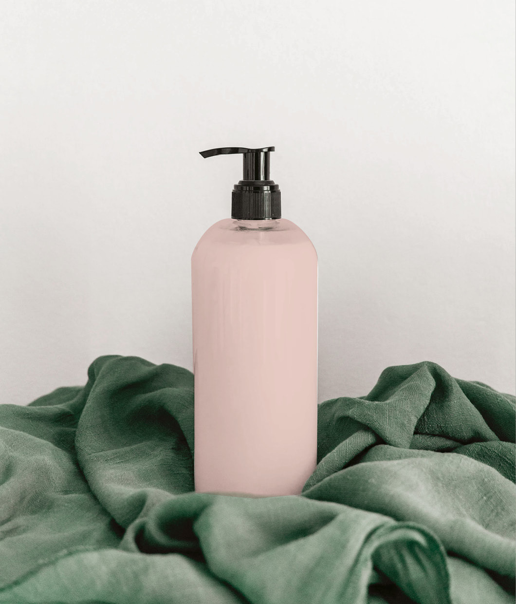
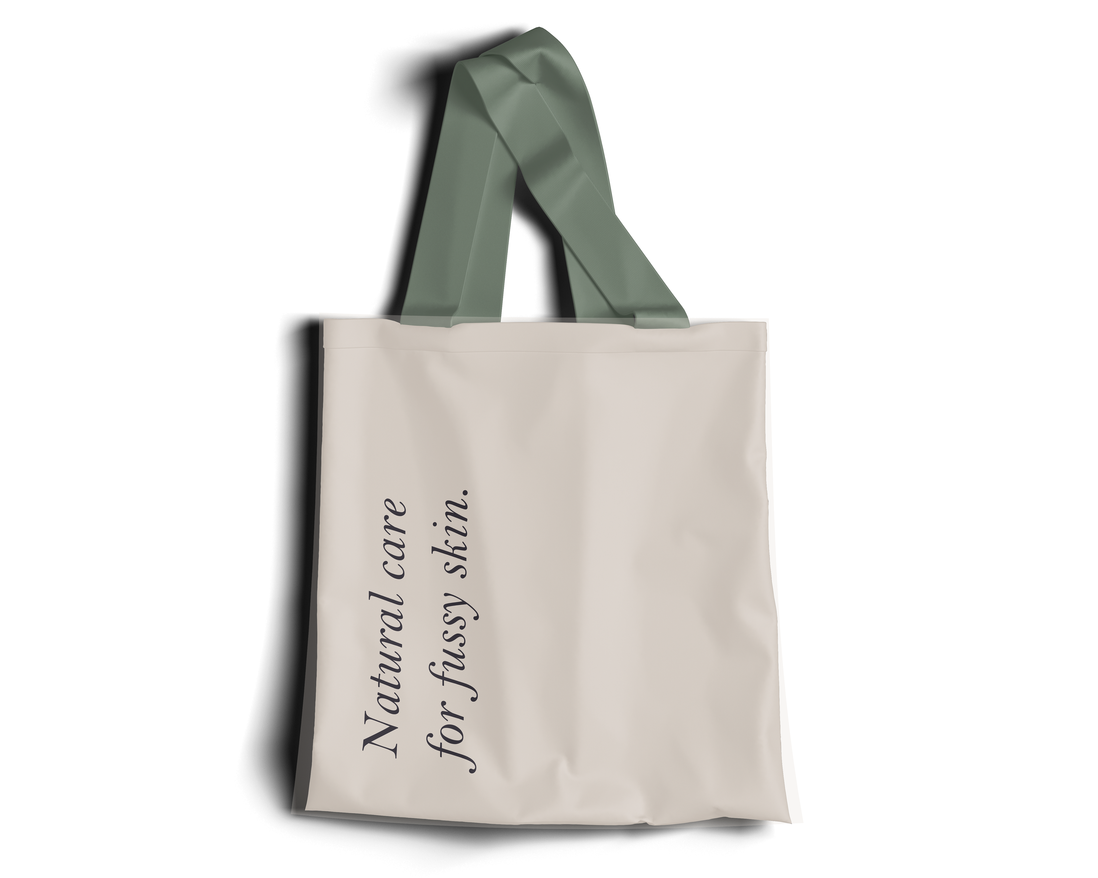
We chose colours to give an earthy, natural feel to the brand. Complimented by natural textures and fabric motifs, we believe our brand gives a feeling of warmth and comfort.
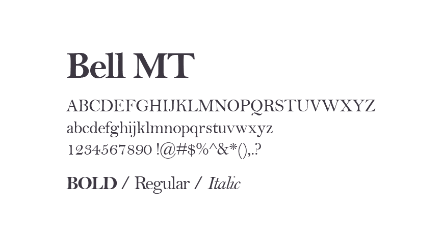
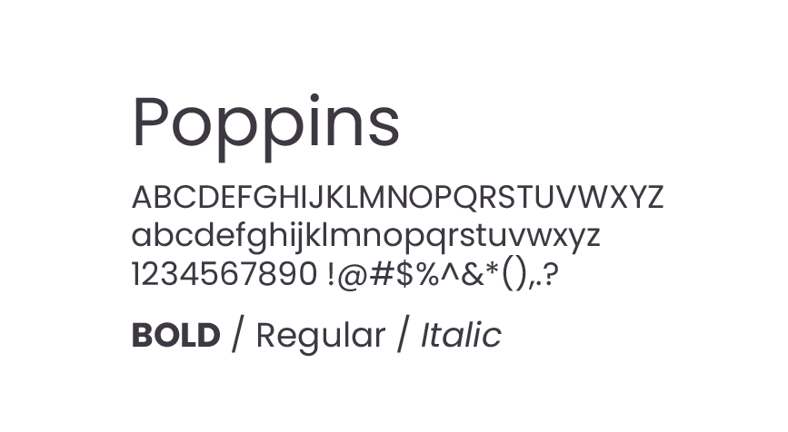
Typography
We chose comforting shapes, that were soft on the eyes to compliment our brand feel.
by Brightkind Design -- Maddy Robinson
